Client: Quantium Desarrollos
Role: Everything
. ____________
The Brief
Proud of the usage of high quality materials for their multiple buildings, Quantium came with a clear objective for an ident: communicate the true quality of their real estate brand.
Based on the important role the organization headquarters influence client trust, they looked for an ident to be used in screens throughout the place that communicated this premise.

Even so, taking in consideration the big impact social networks have nowadays, they looked for a piece that could potentially be used in that domain. Therefore, the ident needed to be capable of being used in 4 ways:
Horizontal --- 15 & 5 sec.
Vertical --- 15 & 3 sec.
___ . _________
Preproduction
In order to generate a long lasting ident that resonated with the true essence of building and trustworth, a closer look was taken to elements with similar characteristics in the organization's work.
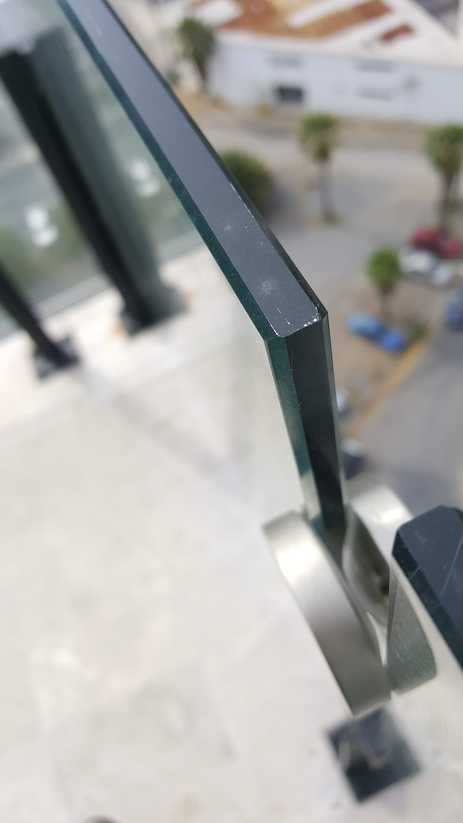
Photo taken by author
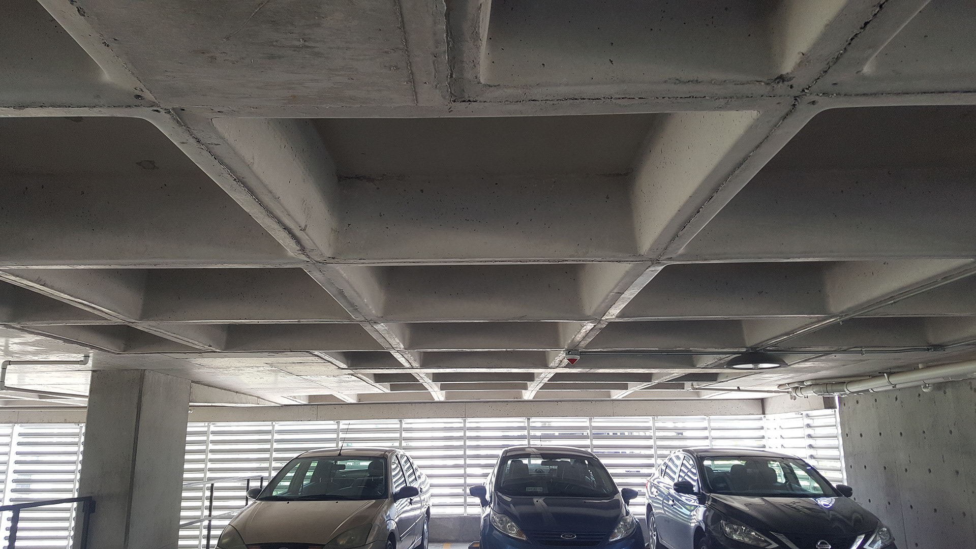
Photo taken by author
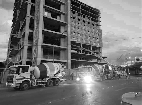
Photo taken by Pedro Davila
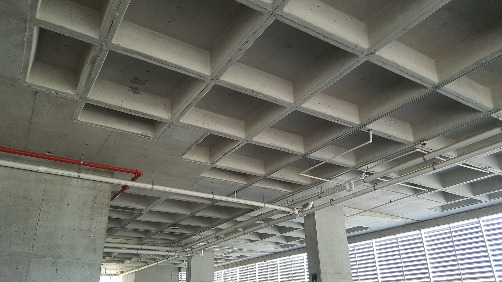
Photo taken by author
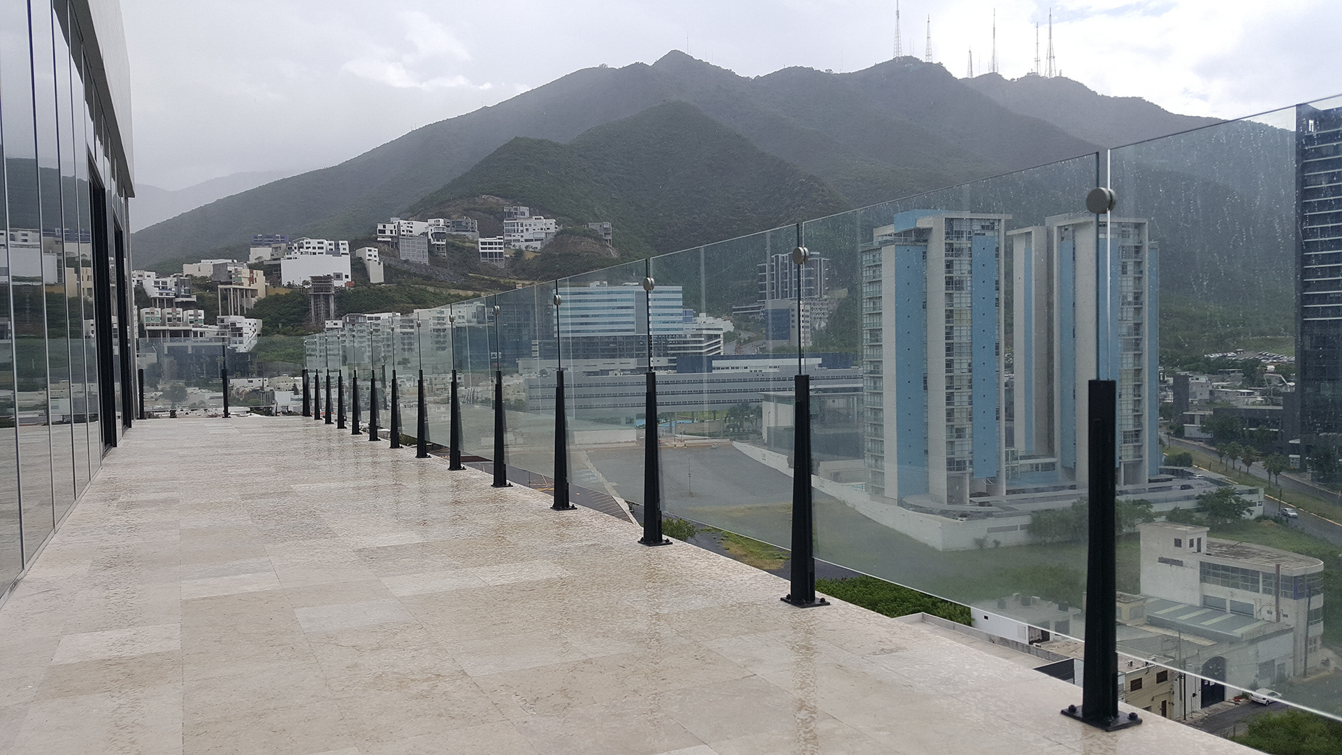
Photo taken by author
I’ve heard it is so important to treat a client like a friend, and let them participate in the creative process. Like Estelle Caswell says: “[...] you have to find the experts and be a good messenger for them.”
When making the first pitch, the client expressed ideas that had so much substance.
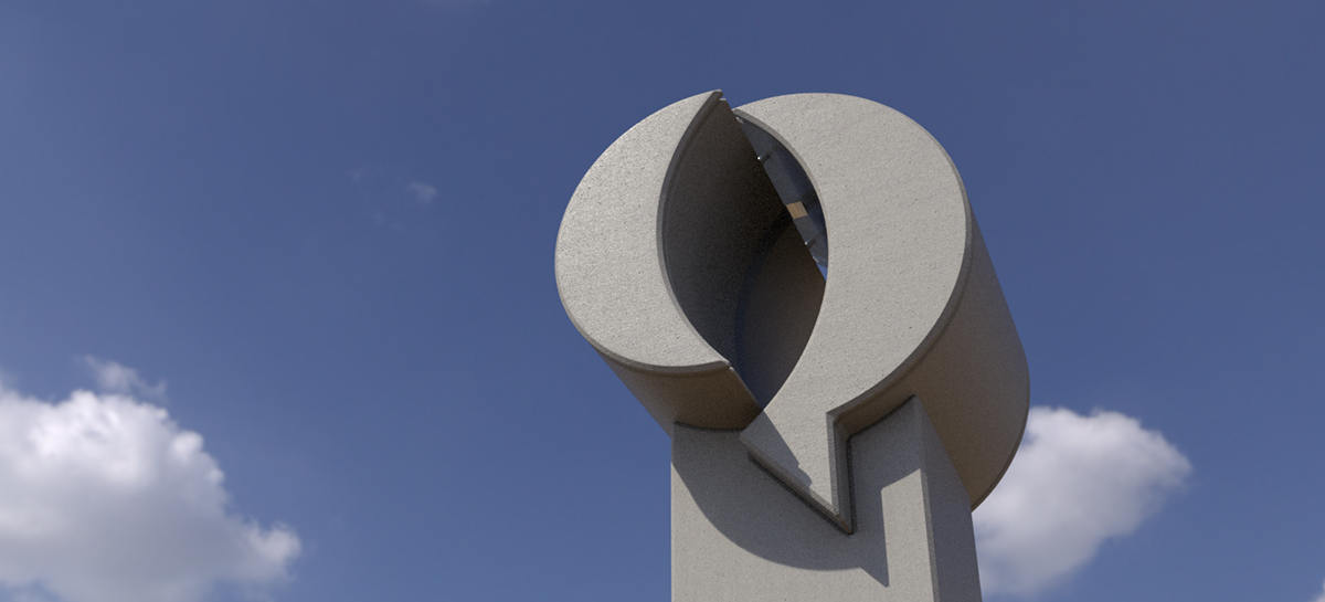
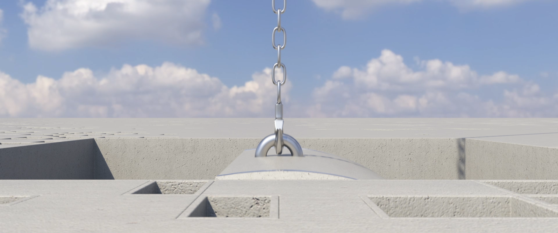
Hearing about how proud they were for their use of high quality long lasting materials (concrete, iron and glass) and their iconic building process (using tower cranes), came to be crucial elements for further development as they worked perfectly around the brief.
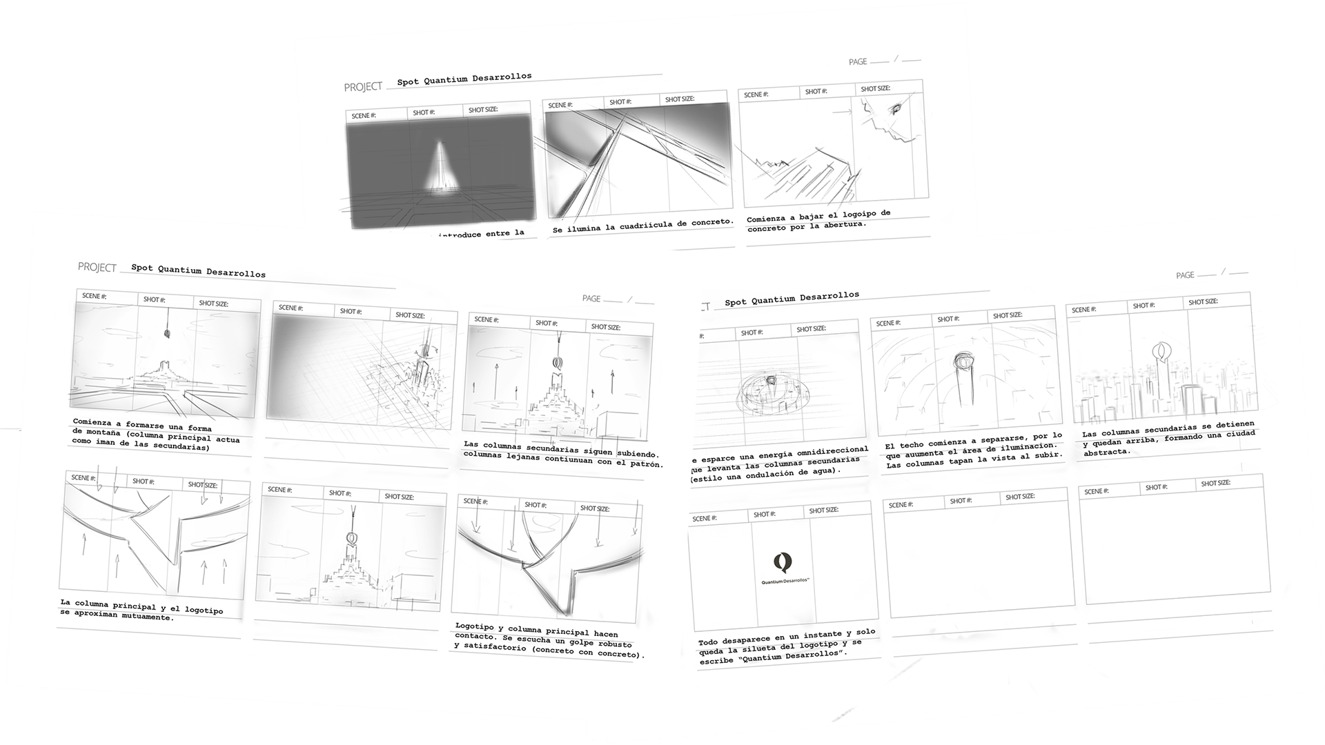
The idea for the storyboard was simple: in every step of the way, Quantium is by your side, making buildings happen.
The horizontal and vertical ratios were managed at the same time in order to keep in mind the multiple visual outputs.
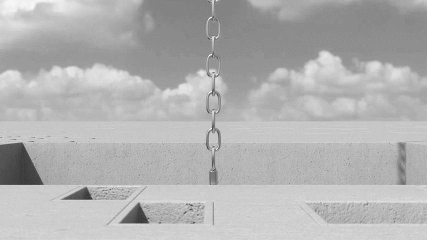
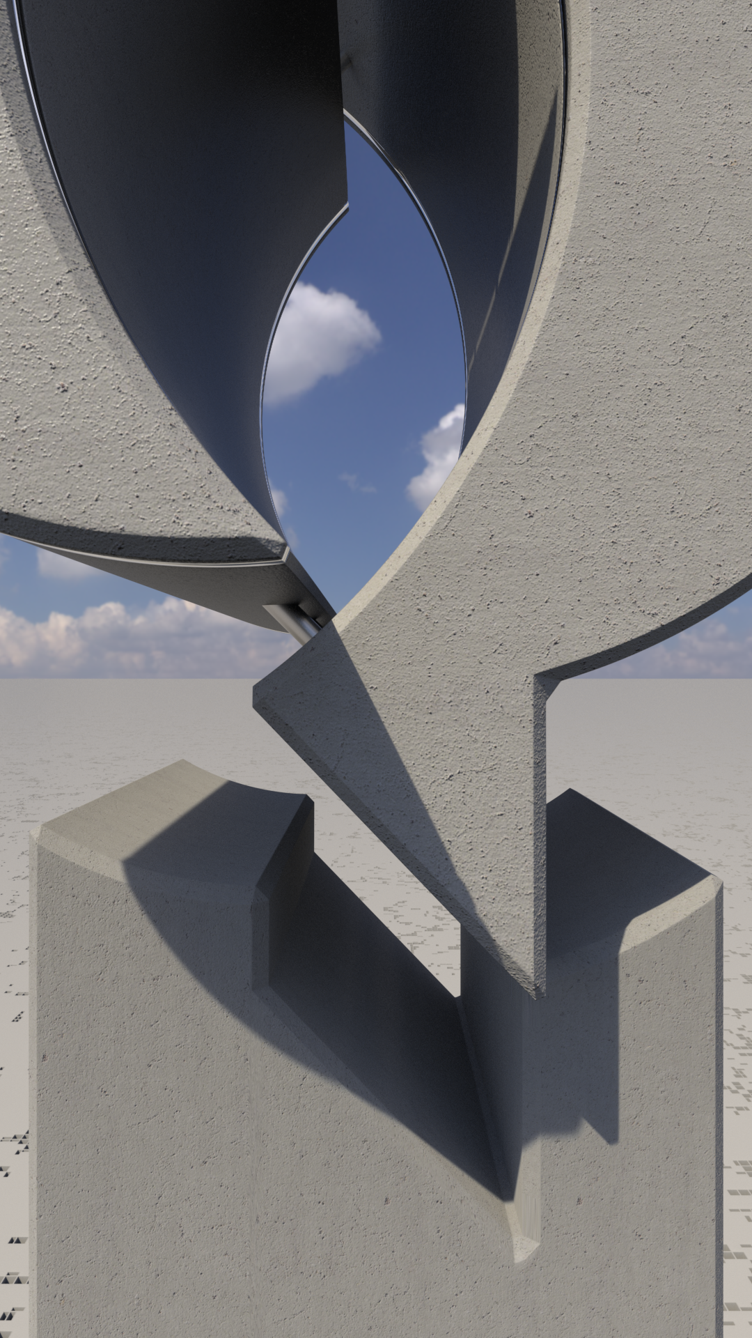
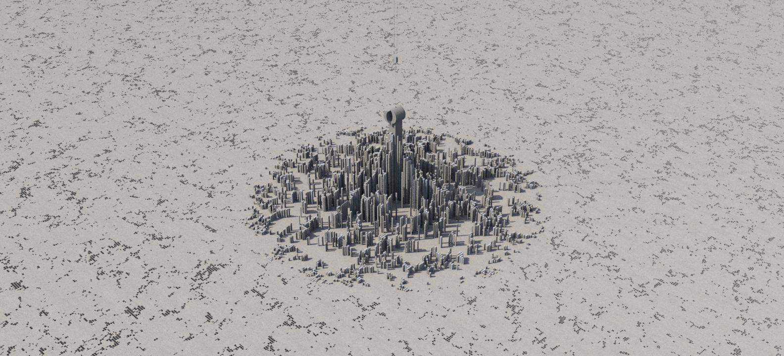
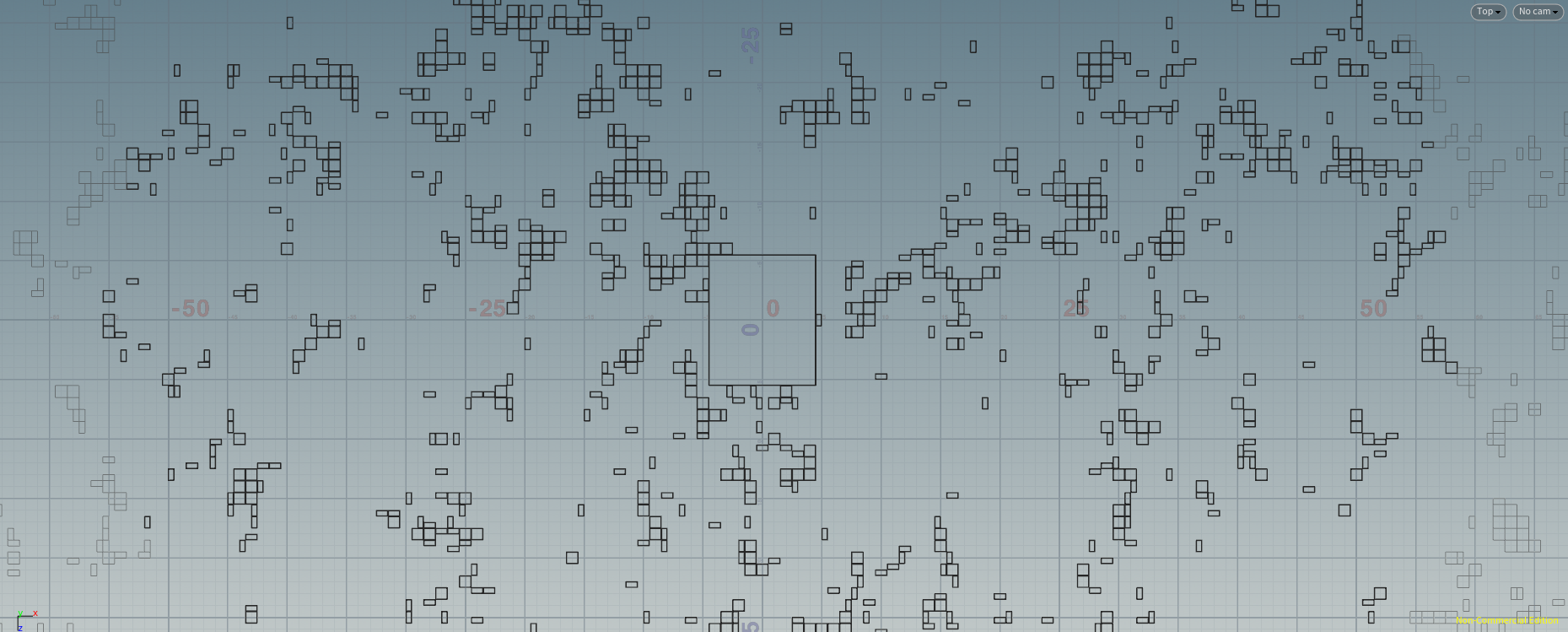
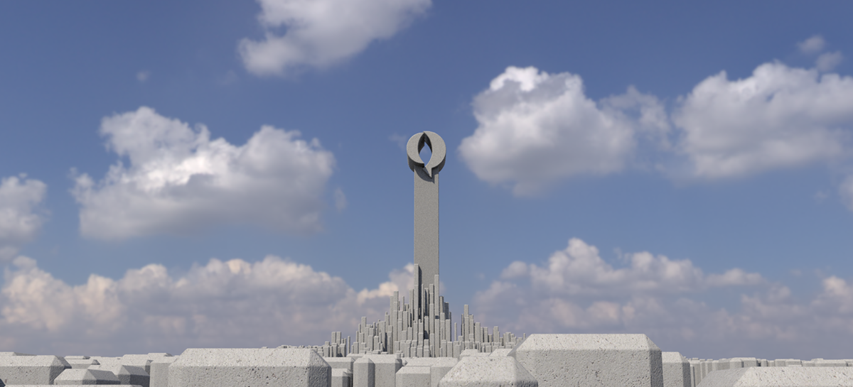
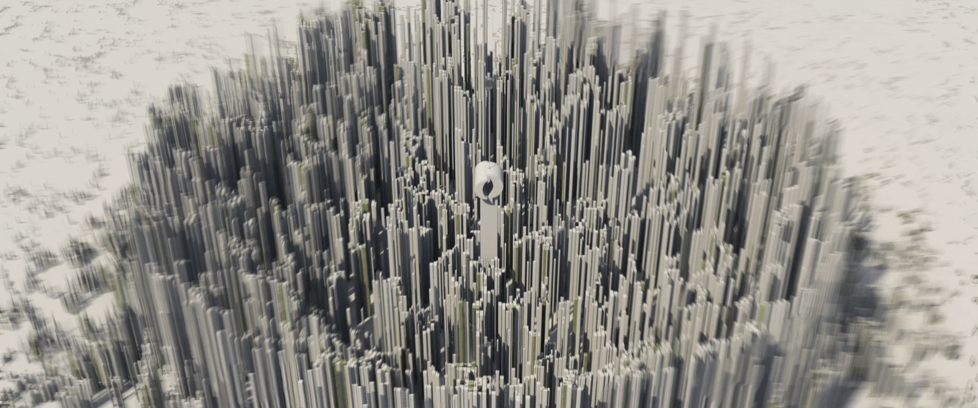
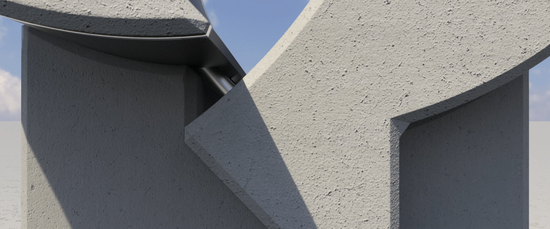
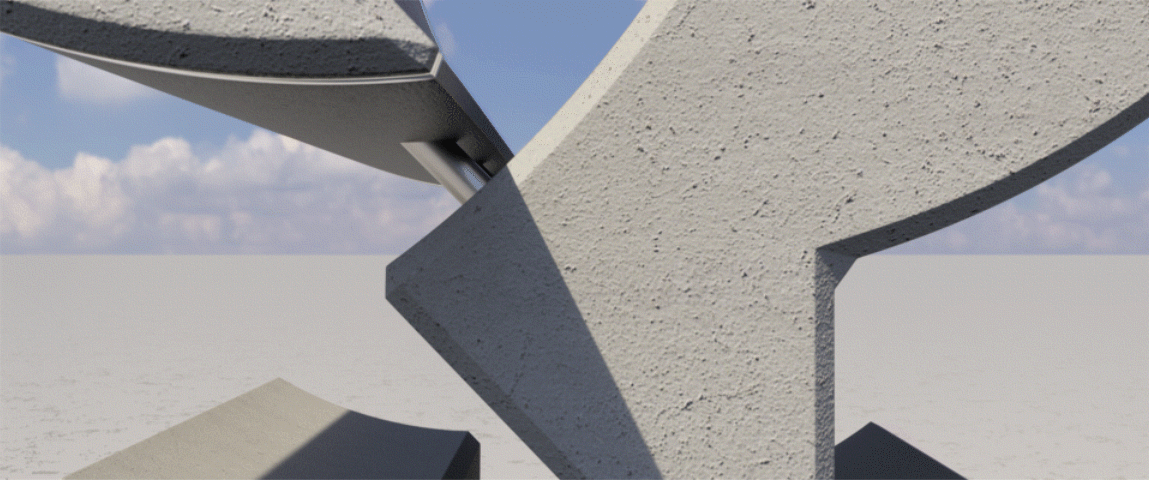
One characterizing aspect about Quantium buildings (designed by LeNoir & Asoc.) is the vast use bevels and rectangle grids in all ceilings. This inspired the idea of the infinite ground grid.
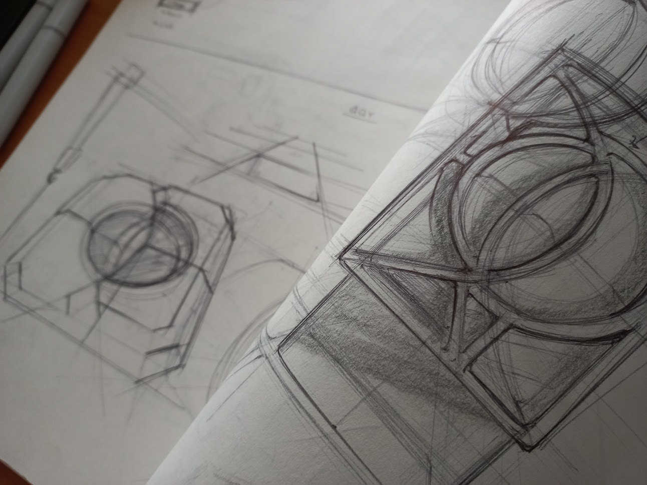
Rough concepts were made an iterated with.
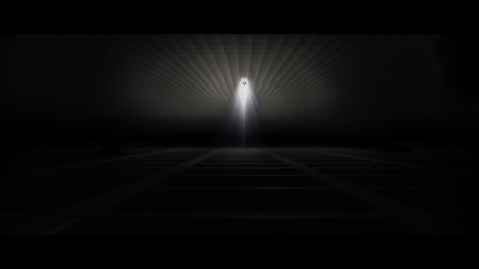
The first ones were too obscure, so it was decided to remove the ceiling.
Then, for time constrains, I decided to focus on the last shot (as it was the most repeated throughout the 4 versions). There was the idea of using a yellowish and glorious tone, but it was discarded as it could be misinterpreted with a contaminated city.
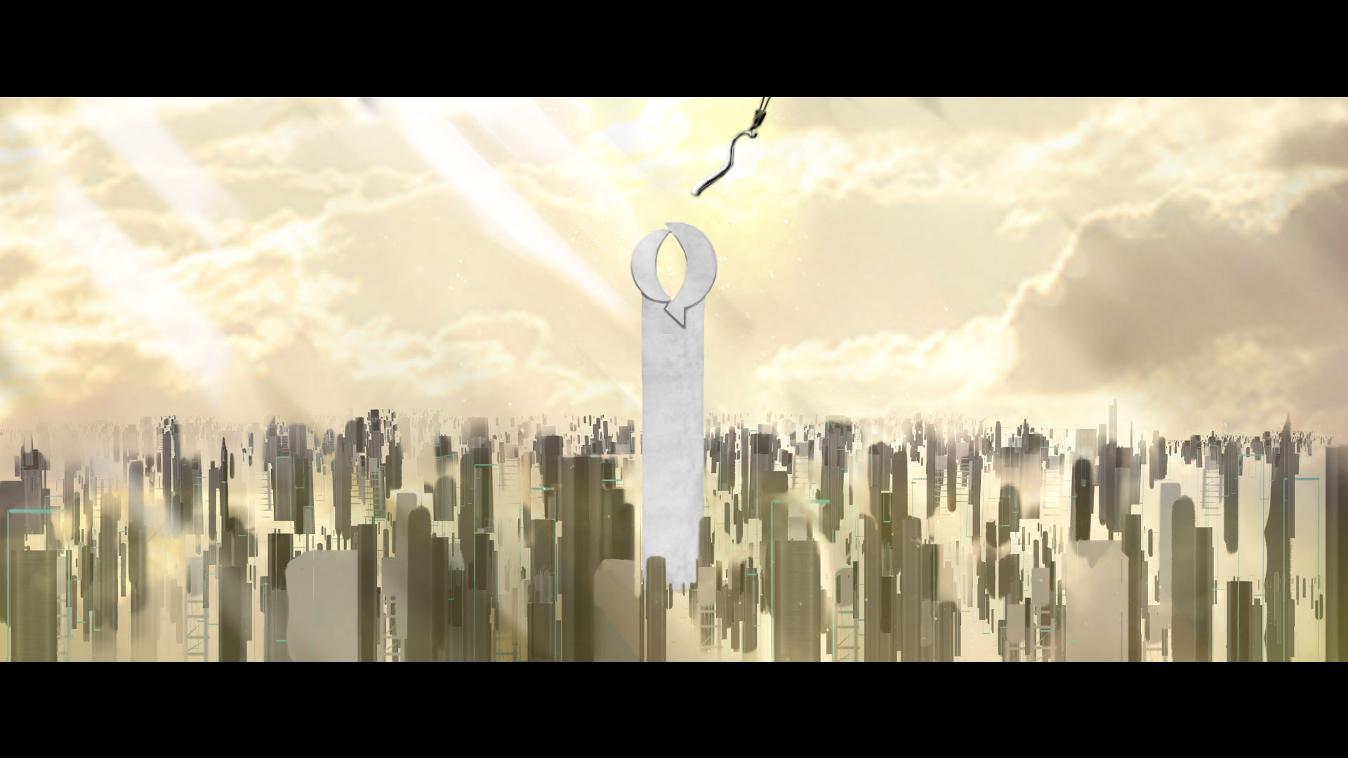
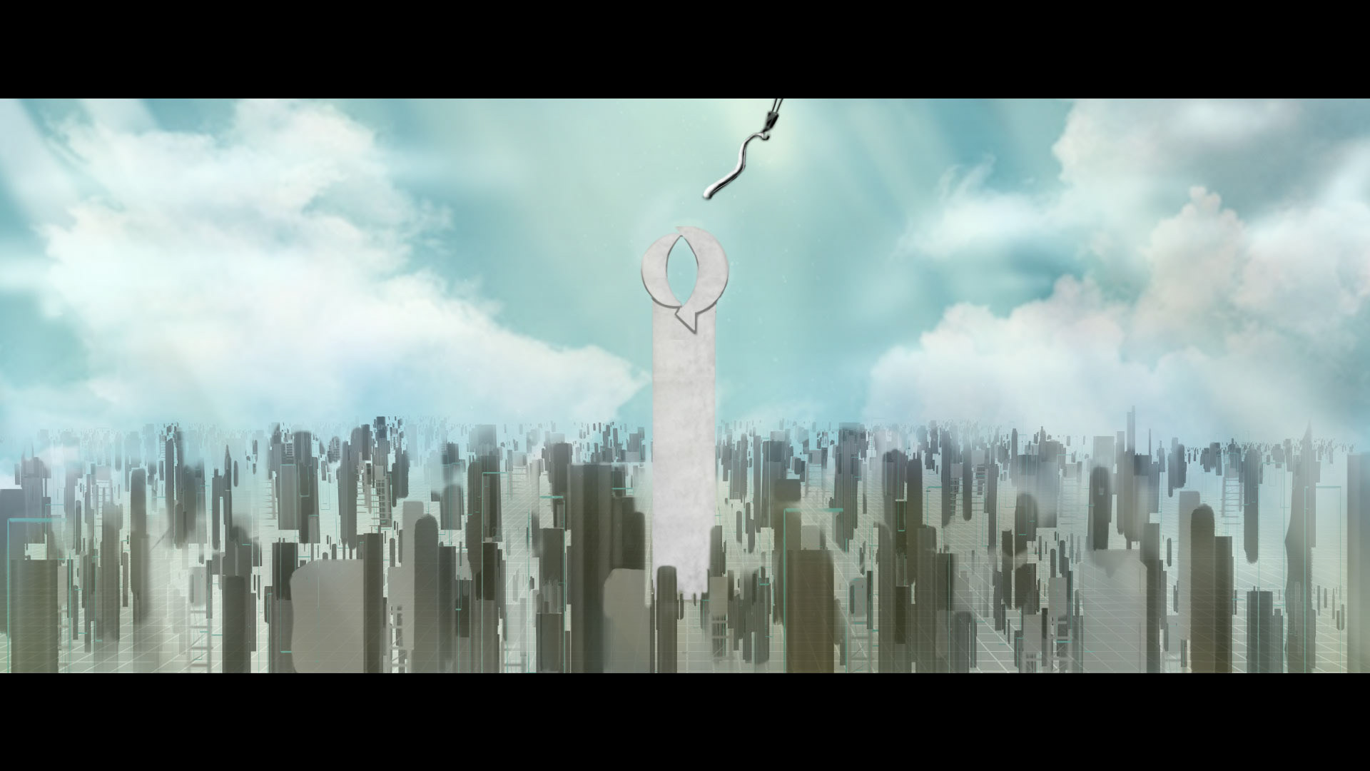
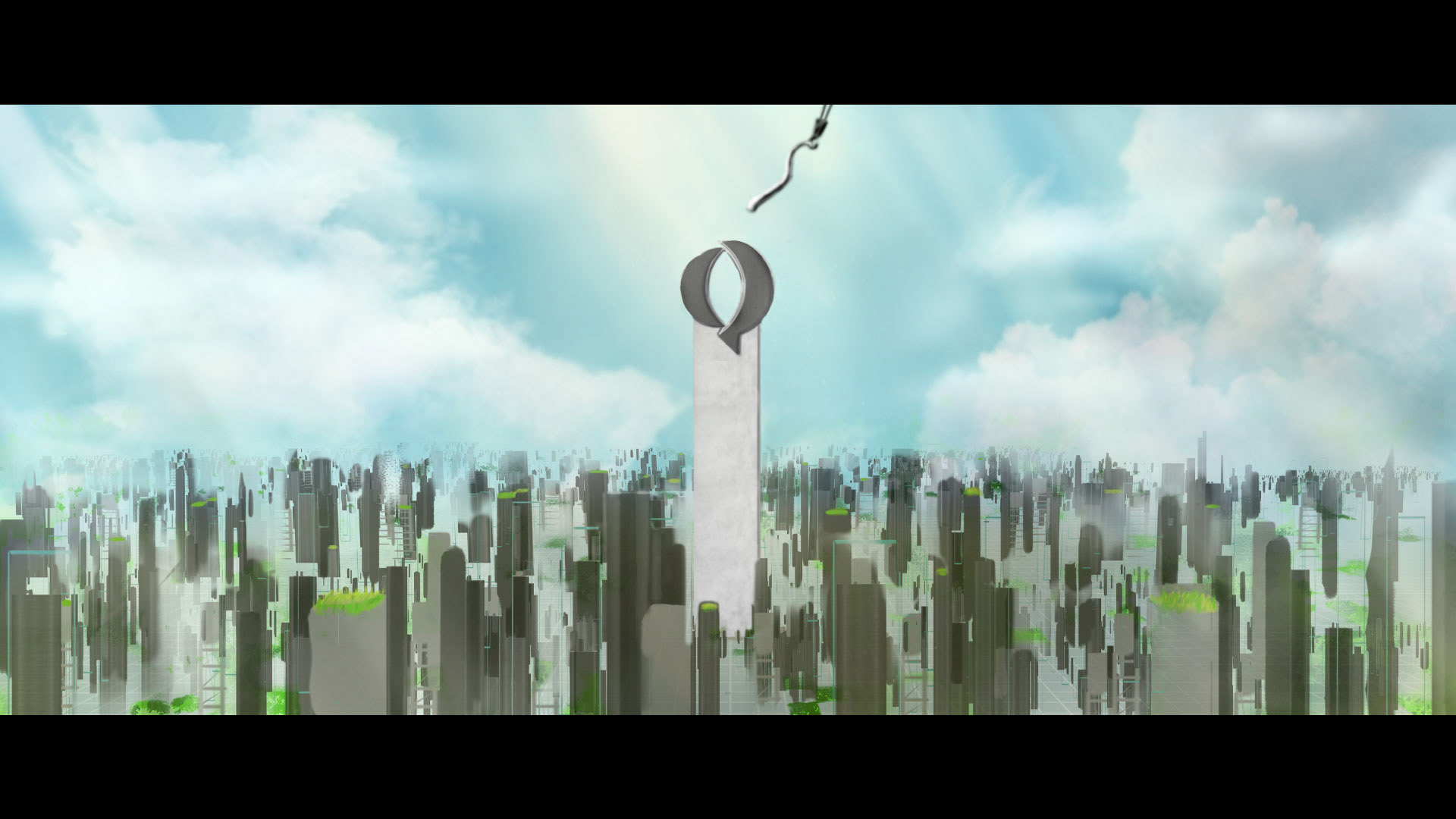
At the end it came to a concept that used more of a clean tone.
The final shot was heavily inspired by New York, the city of skyscrappers. Each “building” being a mix of the three representative materials.
The color pallete ended up being changed to a heavy focus on the concrete gray.
Finally, the animatics were made. It was here were I noticed that the storyboard was too long. And so adjustments had to be made.
The concrete logo initially was supposed to come from the sky, in order to provoke a sense of divinity and respect (fancy). This however felt as an egocentric movement and not in order to the motto "Comprometidos contigo" (committed to you) and work ethic.

It was later changed to a bottom to top movement, as it made so much more sense because it spoke to the distinct characteristic of the organization to accompany the client, and the closeness to the main “building” meant that Quantium carries the force and leadership that makes buildings happen (also, buildings are made that way...).
The final animatic, which evolved to the final outcome, came to be a three shot piece with its own communication purposes:
Shot 1: Quantium starts from the ground, the beginning.
Shot 2: Quantium is power, strength and solidness.
Shot 3: Quantium makes buildings happen.
________ . ____
production
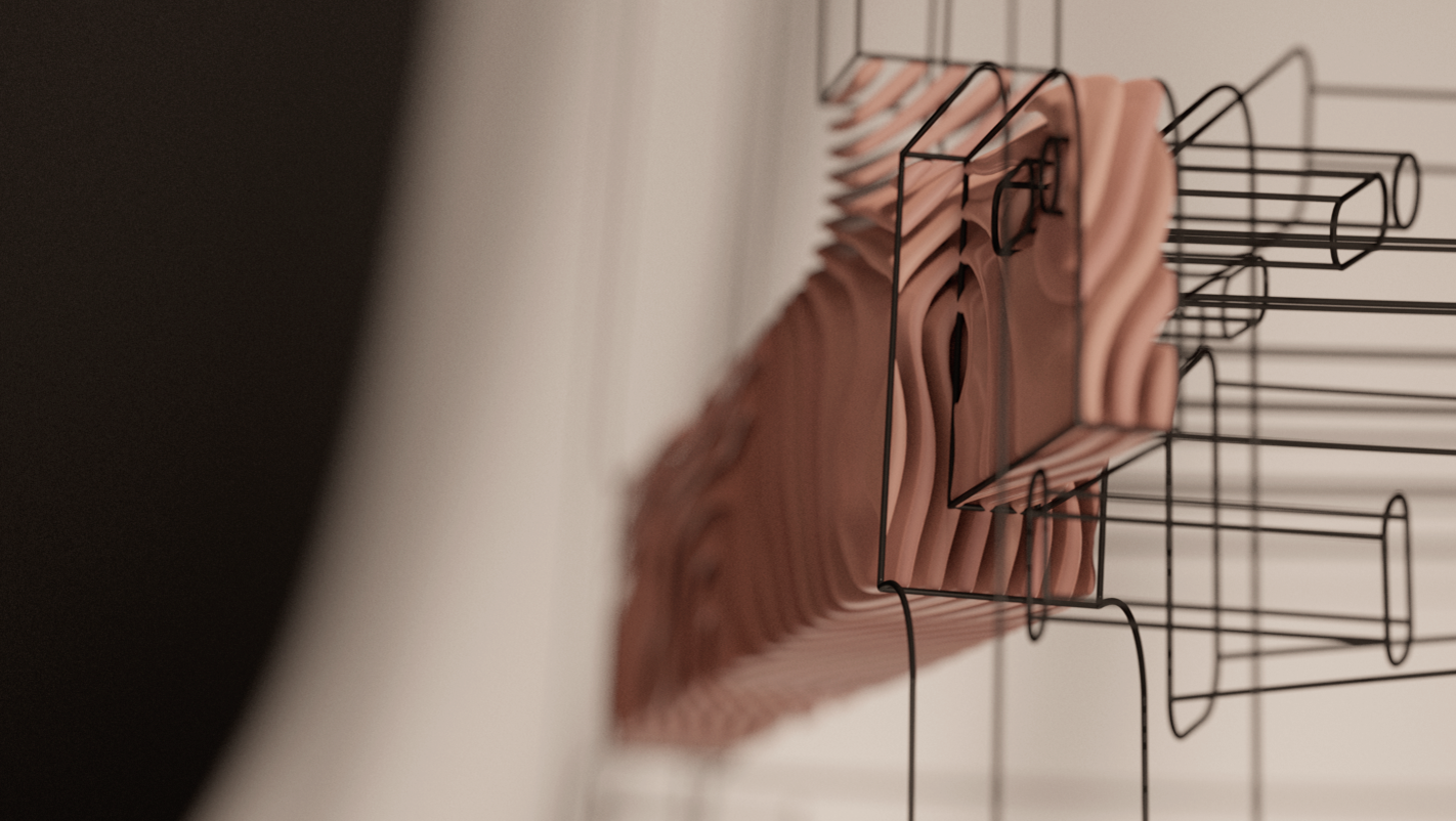
Everything in production was done in Houdini.
The software proceduralism came quite handy when developing the infinite grid and buildings/columns, for it to look organic and have liberty for future composition modifications.
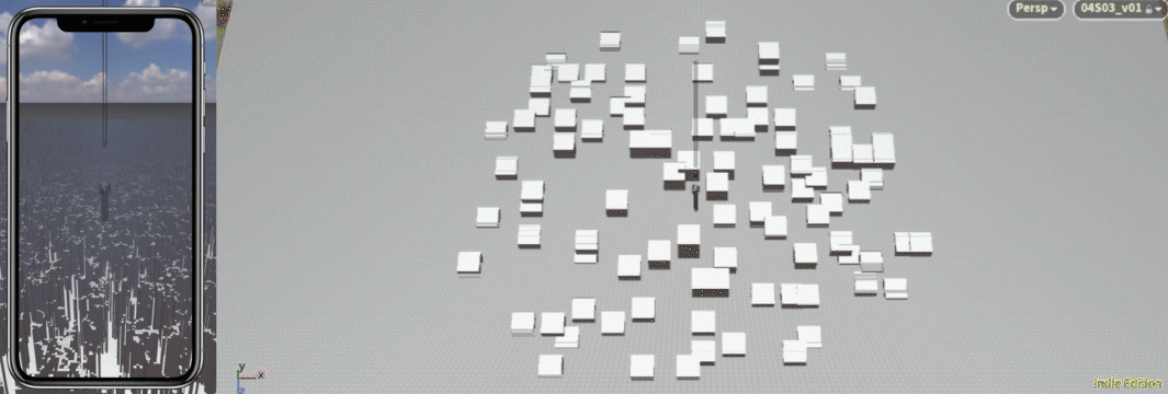
As for the columns positioning, they couldn´t be scattered just like that as there was a mix of squared and rectangle columns, and it needed to replicate the architectural grid pattern; geometry collisions became a problem.
I had to design a procedural tool that assorted the columns correctly. This was basically done by overlapping two types of grids and merging it by using certain algorithms involving area calculation.
MOPs tool was great for the ripple effect on the columns.
The scene became quite heavy, so in order to have a more “real-time” visualization I made a low res proxy geo for animation.
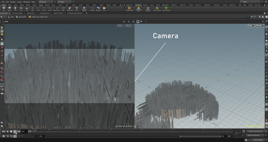
Although the columns were packed objects and I had a great PC upgrade during production, the scene was still heavy and there were severe technical problems when making caches, therefore making render production impossible.
This was resolved by camera culling the geometry (which is like masking everything that isn't in camera). And by using a multi-cache methodology (learned from an U-tad Masterclass), which is basically like doing render multipasses but for portions of geometry instances. This in order to make disk savings your machine can handle and not catch fire in the process.
Everything was then rendered in Mantra.
__________ . __
postproduction
I made a multitrack in Audition using SoundStripe's SFX. The word list made in pre production came to make clear guideline in what sounds were fit for the piece.
Finally, the client set a priority in the two horizontal versions. These were delivered while maintaining the aspect ratio and potential timing constrains of the vertical ones (in case of future need).
5 sec version
____________ .
Big thanks to
Pedro Davila for trusting and giving me a shot with this incredible project.