Client: CRGS
Role: Motion & Title Design
Production: 4U
Music & Sound Design: JP's Music Studio
Graphic Identity: Aide A. Martínez, Raúl Amézaga y Daniela Rodriguez
~ 5 min read ~
. ____________
brief
"A lonely call has become a wave of echoes [...]"
This project was made for the twelfth edition of the Udesign International Conference: "UDESIGN: ECHO".
UDESIGN is an event created by the Roberto Garza Sada Center (CRGS) of Art, Architecture and Design of the University of Monterrey that year after year attracts professionals and artists of international recognition with the aim of knowing the most innovative trends, advances and projects in these areas.


For this edition the conference looked to emphasizes the influential power of the designer. Here laid the reason for the name of this edition: ECHO. CRGS approached with the request of making an opener, along a looped version, that reflected this premise.
There was complete creative freedom, as long as it remained true to the brand identity that had already been made.
____ . ________
THE STORY
The solution had to be correctly taken care up in the story. Everything else could then be constructed just fine.
It all started by looking at the identity and manifesto for the edition. Their proposed graphics looked to me as a metaphor for the «harmony» they talked about. And so the solution was simple. I had to be the storyteller for the backstory of these beautiful waves of echoes:
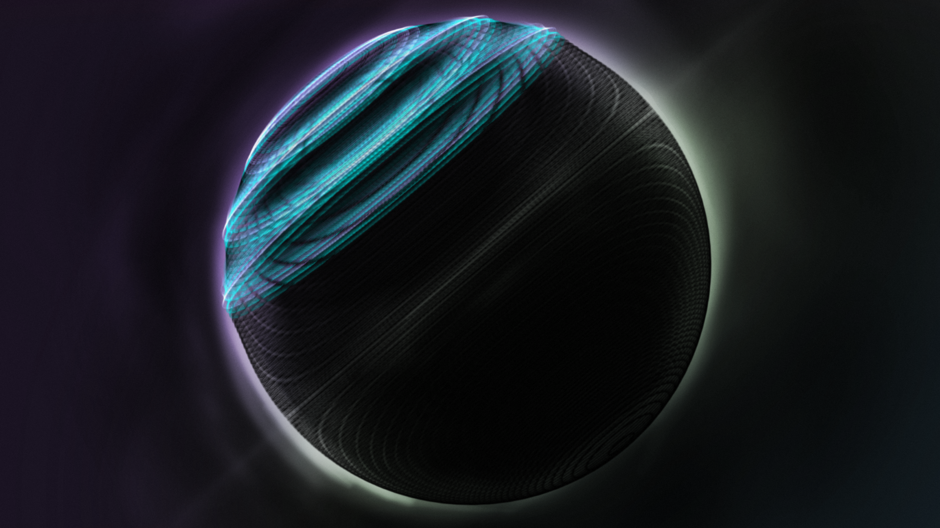
ONCE UPON A TIME, IN AN OBSCURE PLANET...
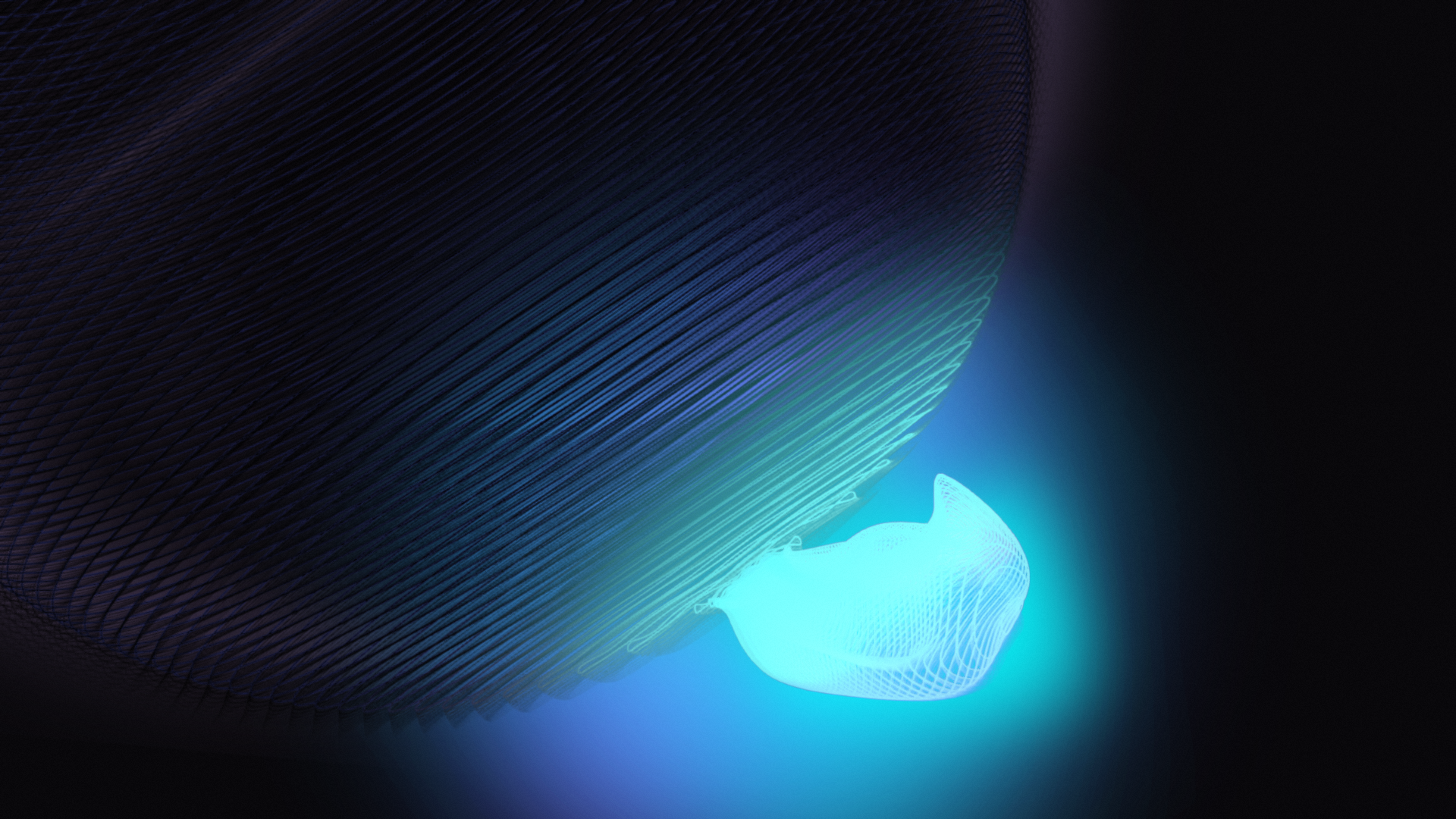
...A TINY LIGHT CAME TO GENERATE A TINY DISTURBANCE...
...THAT ENDED UP GENERATING A GIGANTIC HARMONY.
______ . ______
MAKING OF
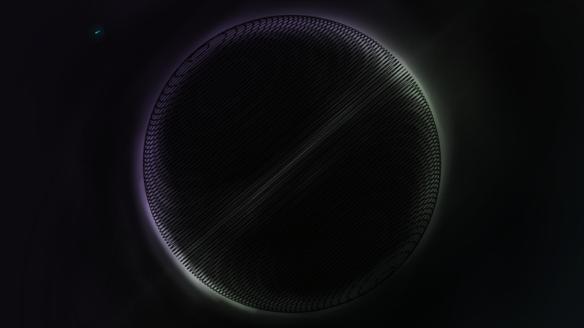
I started by making the storyboard and animatic. I took a lot of reference from space photography. The iconic "The Blue Marble" Earth photography (taken in 1972 by the Apollo 17) was just perfect; I loved the framing.

The most important thing, was to make sure the title sequence made match with the graphic identity. For this, I made styleframes during preproduction in order to clearly pitch the goal idea to the client (and be a concrete guide for me).
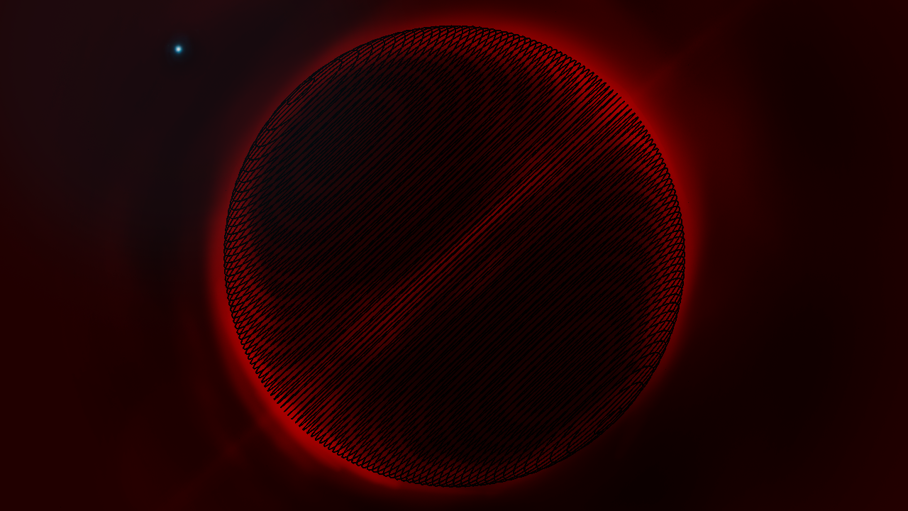


The idea with the intense red was to create an uncomfortable ambience that would later be fixed by the peaceful purple-blue kickstarted by the tiny light. This was later changed as the red lasted for most of the time, and this would be a conflict with the color palette of the identity.
The solution was simply to change to the identity color palette, and show then that the problem was the light shortage.
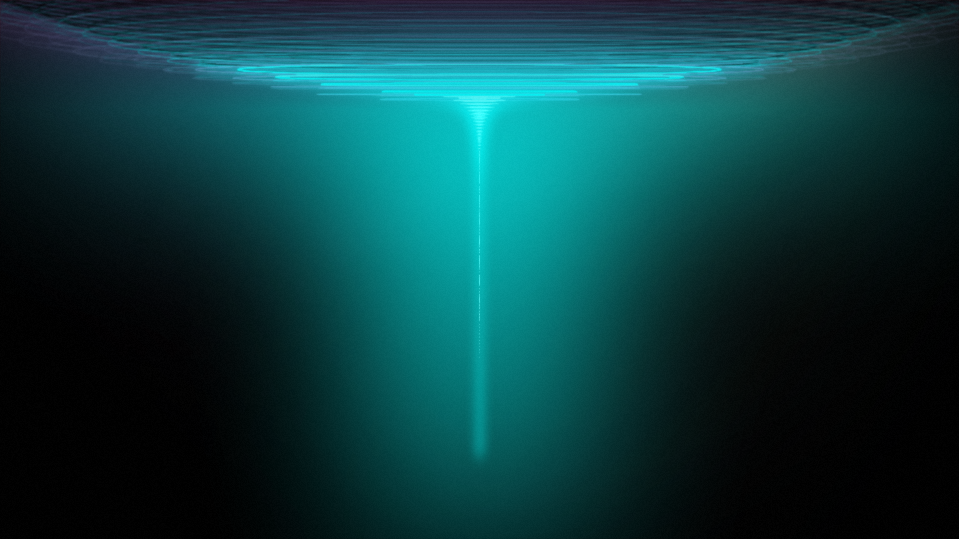
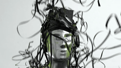
Water came to be strong inspiration of how to physically represent echoes movement. The big spike at the end was inspired by the ocean simulations made in the University of Edinburgh.
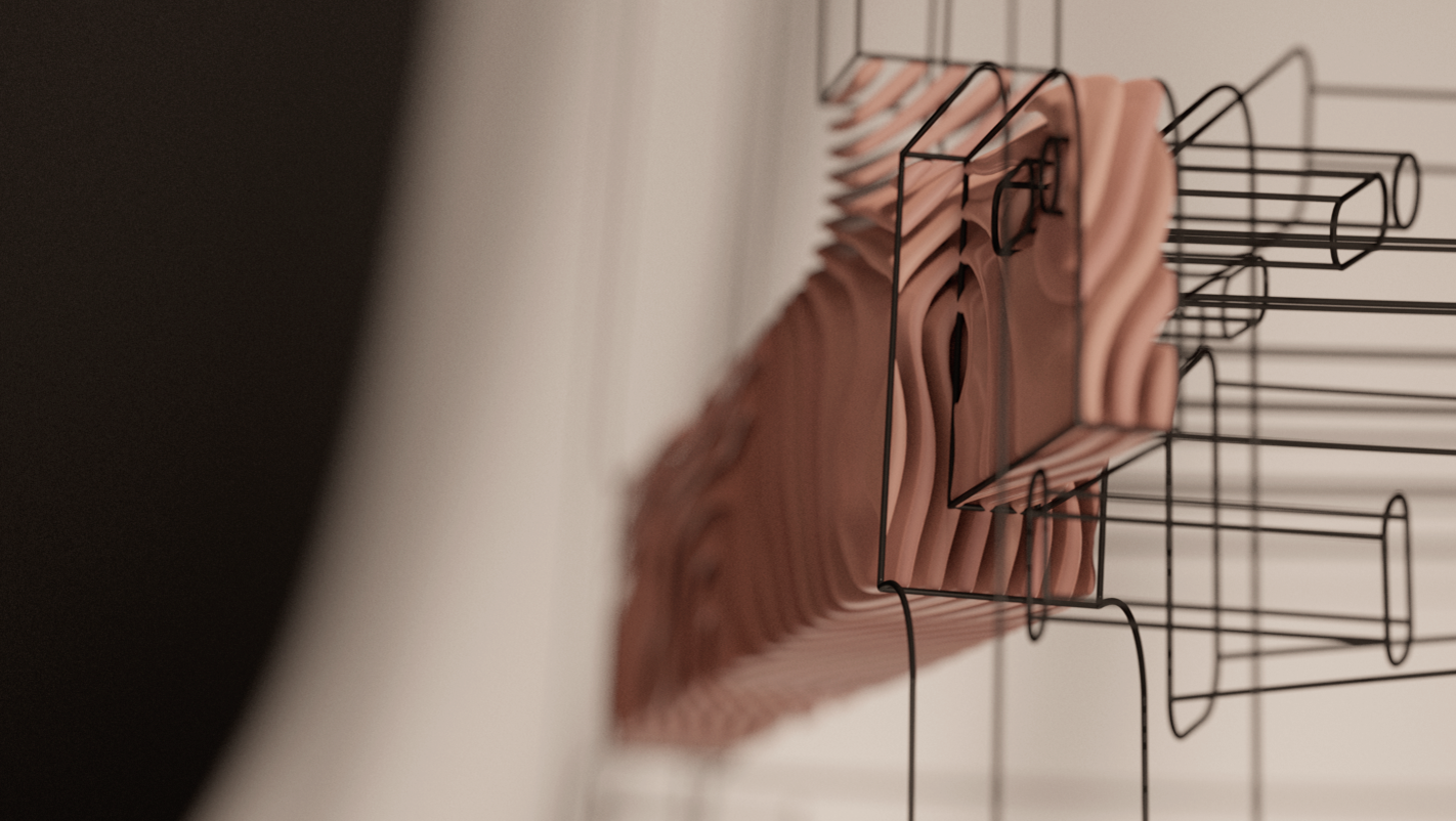
The «splines planet» was done in 3D with Houdini, but all the backgrounds where matte paintings made in Photoshop. I ended up combining both in After Effects in order to make a neat blended composition.

A fun challenge was the loop version. For this I ended up using a blend-shape in Houdini. This made the end position of the splines match with the start position. All this in combination with the sinuous movement.
____________ .
Big thanks to
Kimberley Romero and all the 4U team, for trusting me with such a purposeful project.
With the pandemic and no physical meetup, solitude came to be a frightening kickstart to make creative students question the value of their studies. I'm extremely grateful to have had the opportunity of making an audiovisual that communicated the true potential within every one of us creatives.